ITSOP Case Study
Revolutionizing How Employers and Job Seekers Track Recruitment Success

About ITSOP
The UX design for the Job Portal Metrics Dashboard is crafted to offer a seamless and intuitive experience for recruiters and hiring managers. The dashboard presents key performance indicators (KPIs) and metrics in a visually engaging and easily digestible format, facilitating data-driven decision-making.
Roles and Responsibilities :
UX & UI Design
Project Overview
As a UX Designer for the ITSOP Job Portal, my goal was to redesign the employer-facing dashboard, focusing on improving how recruitment metrics are displayed and how actionable insights are provided. The platform’s previous dashboard was cluttered and unintuitive, making it difficult for hiring managers to make informed decisions about their recruitment campaigns. The redesign aimed to simplify the experience, reduce friction, and empower employers to make better, faster decisions.
Challenges & Problem Statement
Presenting the data such as graph and table in a comprehensible and actionable manner is complex.
Data Complexity and Visualization
The previous website design lacked colours, typography and iconography
Responsiveness and Accessibility
Brand identity was the ideal part which was least focussed on.
Integration with Other Systems
Goals
1
Implement interactive elements like tooltips and drill-down capabilities to provide detailed insights without overwhelming the user.
2
Follow web accessibility standards (such as WCAG) to make the dashboard usable for people with disabilities, including those who use screen readers.
3
Offer regular updates and improvements based on user feedback to keep the dashboard relevant and useful.
4
Provide detailed documentation and support for integration processes.
Design Process
Empathize
Define
Ideate
Prototype
Test
Competitive Analysis
Naukri
Good
All features available
and easy to access
Easily accessible
Simple navigation
Tedious flow
Does not focus
on brand identity
Cool colour used,
friendly
Needs better design
Less white space
makes it difficult,
design changes required
Cool colour used, Friendly
Focuses on Brand identity
Tedious flow
Choices are more makig the
navigation difficult
Easily accessible
Data not clear
Good
Indeed
Needs better design
Cool colour used, Friendly
Focuses on Brand identity
Easy to achieve the
user goal
Simple Navigation
Easily accessible
Data not available
Good
ZipRecruiter
Tool Experience
Features
Accessibility
Navigation
User Flow
Brand Identity
Tone
Descriptiveness
Inferences
While competitors offered detailed data, none of them made it easy to digest. Simple, well-organized dashboards with key insights were rare.
Simplicity Over Volume
Users crave more than just numbers—they need contextualized insights and suggestions on how to improve performance.
Actionable Data
Persona

Ethan
The Career Seeker
Age : 28
Job: Recent College graduate
Goals: Find a job that aligns with their skills and interests
Worries: Difficulty finding relevant job openings, overwhelming job search process
Needs: Easy-to-use search functionality, personalized job recommendations, clear application process, progress tracking

Olivia
The Recruiter
Age : 35
Job: HR Manager
Goals: Efficiently source and hire top talent.
Worries: Time-consuming candidate screening, difficulty finding qualified candidates
Needs: Advanced search filters, candidate management tools, applicant tracking system, analytics on recruitment performance

Sophia
The Employer
Age : 45
Job: CEO of a tech startup
Goals: Attract top talent, streamline hiring process
Worries: Difficulty finding qualified candidates, complex hiring workflows
Needs: Employer branding tools, talent analytics, easy-to-use job posting and management tools
User Journey Mapping
To understand the user’s experience, we mapped out the user journey for Alex representing the stages she would go through in her property search:

Information Architecture

WireFrame


Design System
Primary Colors
Typography
Secondary Colors
FBF9FF
EBEBF5
2F244F
FBFBFB
E5E7EB
9CA3AF
4B5563
Heading 2
Fira Sans - Semibold
Heading 1
Fira Sans - Semibold
24
20
Heading 3
Fira Sans - Regular
16
Heading 3
Open Sans - Regular
12
Button
Segoe UI - Semibold
18
Buttons
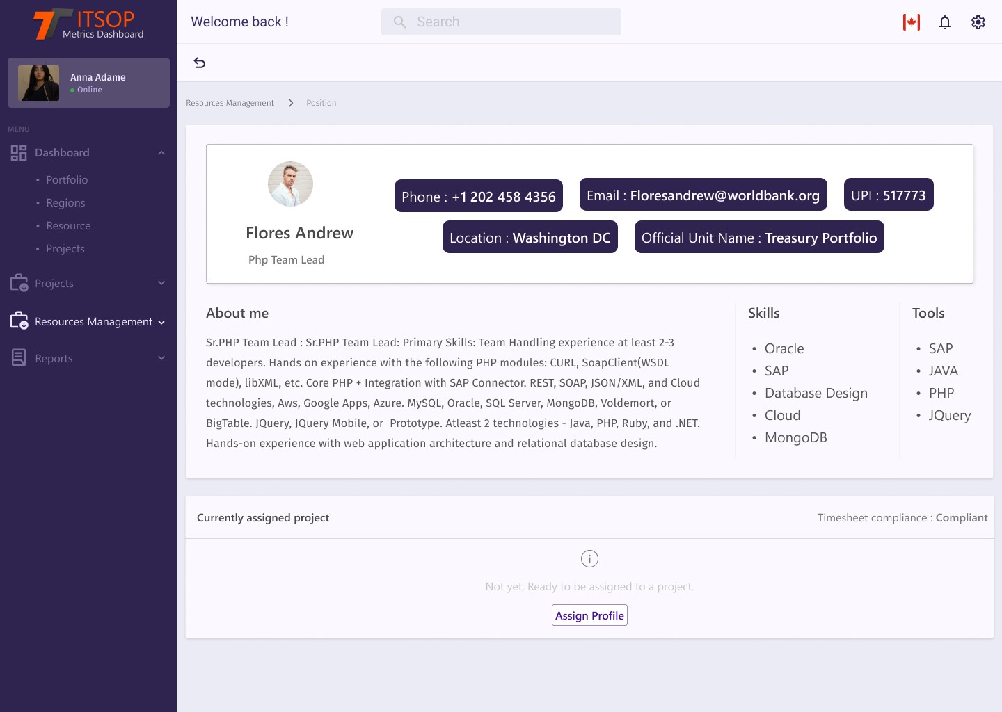
View Profile
Assign Profile
Grid System
Desktop
Column width: 80px
Gutter: 24px
Columns: 12
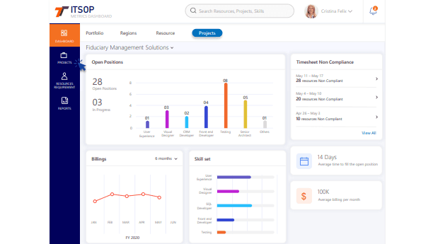
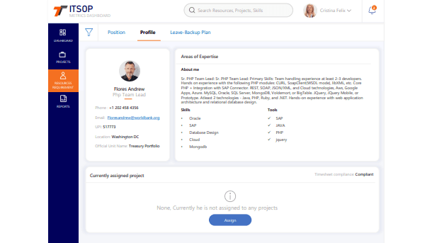
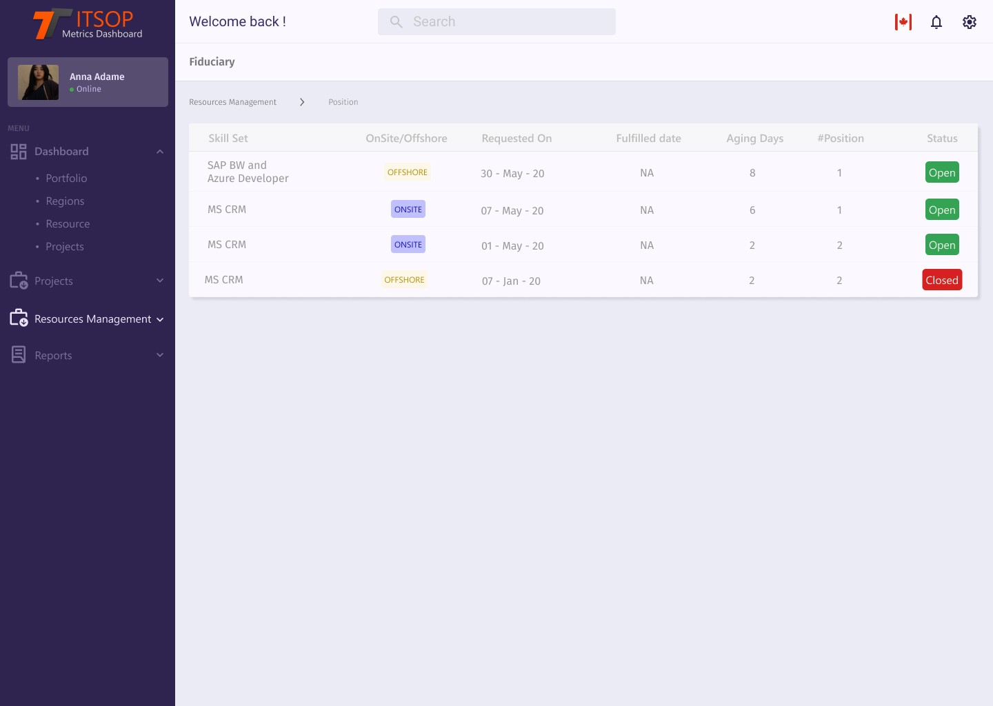
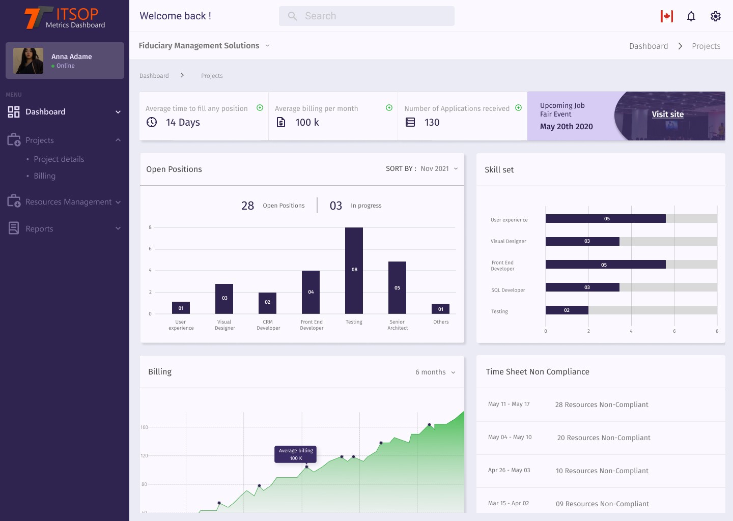
With the improved information architecture and design system in place, I created a high-fidelity prototype using Figma. Key changes included:
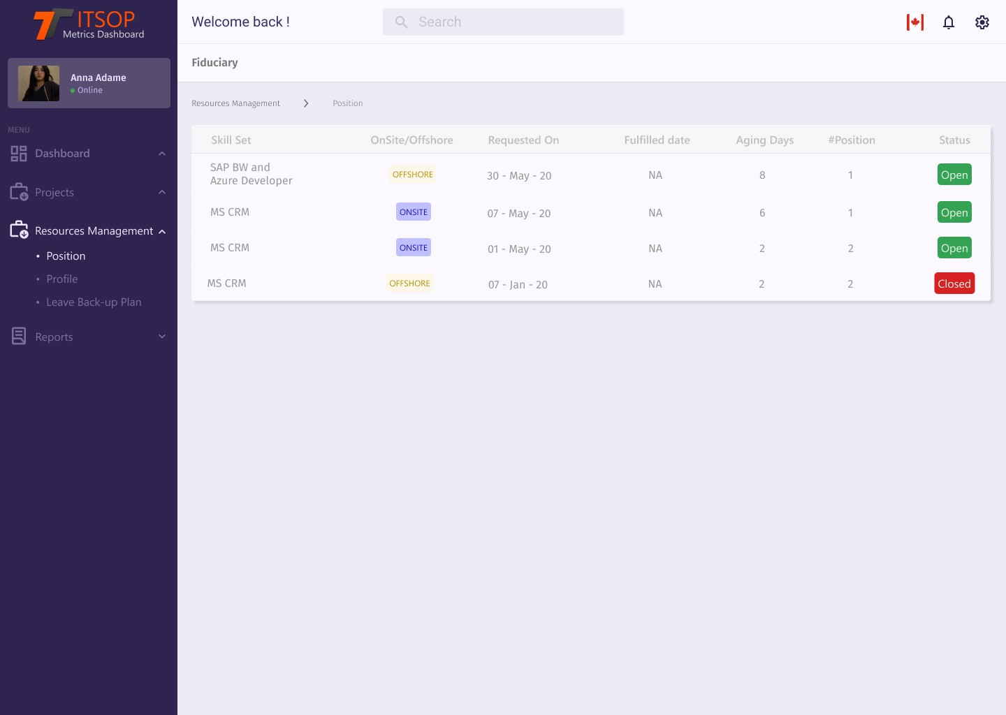
Actionable Metrics Dashboard : A central panel showing the most important metrics, with quick links to drill down into more detailed data.
Interactive Performance Tracking : The ability to view job posting performance over time, with color-coded visual indicators showing trends.
Real-Time Alerts : Notifications appeared when a job posting required immediate attention (e.g., underperforming or nearing application deadline).
Comparative Insights : Employers could now compare job listings side by side, making it easy to determine where resources should be focused.
Solution Implementation


The redesigned ITSOP dashboard was a major success, both for users and the business:
Increased Efficiency : Emma and other hiring managers reported a 50% reduction in the time spent analyzing data. The intuitive interface allowed them to focus more on decision-making and less on data gathering.
Improved Hiring Speed : By having clear, actionable insights, employers could make faster, better decisions, leading to a 15% faster time-to-hire
Higher User Satisfaction : Post-launch surveys revealed a 30% increase in user satisfaction, with users appreciating the dashboard’s simplicity and clarity.
Increased Platform Engagement : The platform saw a 20% increase in active users as hiring managers used the new dashboard more frequently and felt more confident in their decision-making.
End Result

Link to Prototype :
Back to the Top