Dan Baldini Case Study
Redefining Property Search:
Smarter Solutions for Renters and Leasors!

About Dan Baldini
This design focuses on creating an attractive, user-friendly, and professional online presence for Dan Baldini Real Estate, making it easy for visitors to explore properties, learn about services, and get in touch with the team.
Roles and Responsibilities :
UX & UI Design
Project Overview
As a UX & UI Designer, I was tasked with redesigning the Dan Baldini Real Estate website, specifically focused on making the property search experience more intuitive and user-friendly. The goal was to simplify the process of renting and leasing properties, reducing the stress renters like Sarah felt when using the site, while ensuring the business met its objectives of increased user engagement and conversions.
Challenges & Problem Statement
The website at first was not in an accessible way attending to the user’s needs.
Accessibility
The previous website design lacked colours, typography and iconography
Design
Brand identity was the ideal part which was least focused on.
Brand Identity
Goals
1
The goal was to make the design accessible to all age groups by following the WCAG 2.0 Design Guidelines
2
Provided a brand identity emphasizing on the brand colors and design system.
3
Simplified the user flow achieving successful task completion while testing with the end users.
4
Followed design principles of emphasize and grouping.
Design Process
Empathize
Define
Ideate
Prototype
Test
Competitive Analysis
Desktop website
Experience
Desktop website
Experience
Features
Accessibility
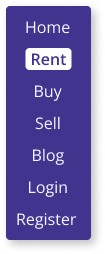
Navigation
User Flow
Brand Identity
Tone
Descriptiveness
ReMax
Average
Map and grid page
unavailable
Easily accessible
Simple navigation
less steps to
achieve the goal
Focuses on Brand
identity
Warm colour used,
not friendly
Needs better design
Design is good, requires
easier user flow
Cool colour used, Friendly
Focuses on Brand identity
Tedious flow
Choices are more makig the
navigation difficult
Easily accessible
filters and dropdowns
are present
where needed helpful
in narrowing down choices
Good
99acres
Design is good, requires
easier navigation
Cool colour used, Friendly
Focuses on Brand identity
More steps are required to
achieve the user goal
Simple Navigation
Easily accessible
listing page is smaller
and map larger
making it difficult to
navigate
Good
Rentals.ca
Inferences
The website at first was not in an accessible way attending to the user’s needs.
Strong Search Functionality
High-quality photos and detailed floor plans enhance trust and decision-making.
Visual Quality
Offering personalized recommendations and saved searches increases user retention and engagement.
Personalization
Ensuring the platform is mobile-friendly is essential, as users frequently access property listings on the go.
Mobile Responsiveness
Persona

Alex Carter
Urban Professional
Age : 28
Job: Software Engineer
Goals: Find a modern, centrally located apartment close to the office and public transportation.
Worries: Balancing rent affordability with proximity to work.
Needs: Virtual tours to save time on site visits.

Priya Sharma
Growing Family
Age : 35
Job: School Teacher
Goals: Find a spacious home in a family-friendly neighborhood.
Worries: Finding properties within budget while meeting family needs.
Needs: Neighborhood reviews and school ratings.

Jordan Lee
The First-Time Renter
Age : 22
Job: College Graduate, Marketing Intern
Goals: Find an affordable apartment near work or transit.
Worries: Limited budget and no prior rental experience.
Needs: Budget calculators and cost breakdowns.
User Journey Mapping
To understand the user’s experience, we mapped out the user journey for Alex representing the stages she would go through in her property search:

Information Architecture

WireFrame


Design System
Primary Colors
Typography
Secondary Colors
F2F5FE
40348E
6362EC
FBFBFB
E5E7EB
9CA3AF
4B5563
Heading 2
Open Sans - Semibold
Heading 1
Open Sans - Semibold
32
20
Heading 3
Open Sans - Regular
14
Heading 3
Open Sans - Regular
12
Button
Segoe UI - Semibold
18
Buttons
Button
Button
Button
Grid System
Desktop
Column width: 80px
Gutter: 24px
Columns: 12
Components
Enjoy Our Condo Apartments
Explore Listings


Stacked Townhouse
Townhouse
Purchase an energy-efficient home and receive rebates and tax incentives that save you money and benefit the environment.
Energy-Efficient Homes
Upgrade to premium finishes and appliances at no extra cost on select luxury properties.
Luxury Home Perks
Enjoy significant discounts on select properties. Don't miss out on these limited-time offers!
Limited-Time Discounts
Next


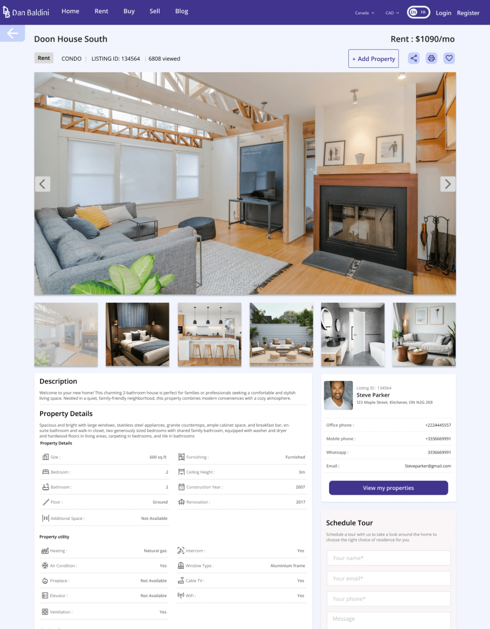
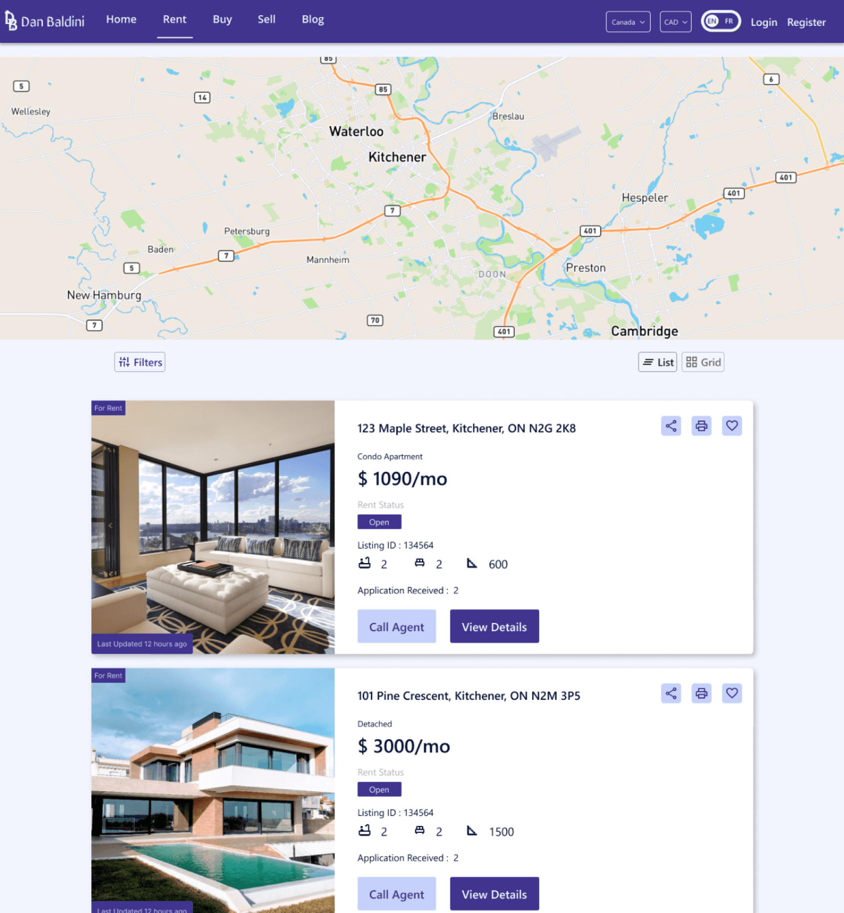
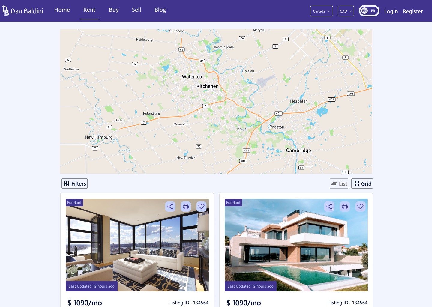
With the improved information architecture and design system in place, I created a high-fidelity prototype using Figma. Key changes included:
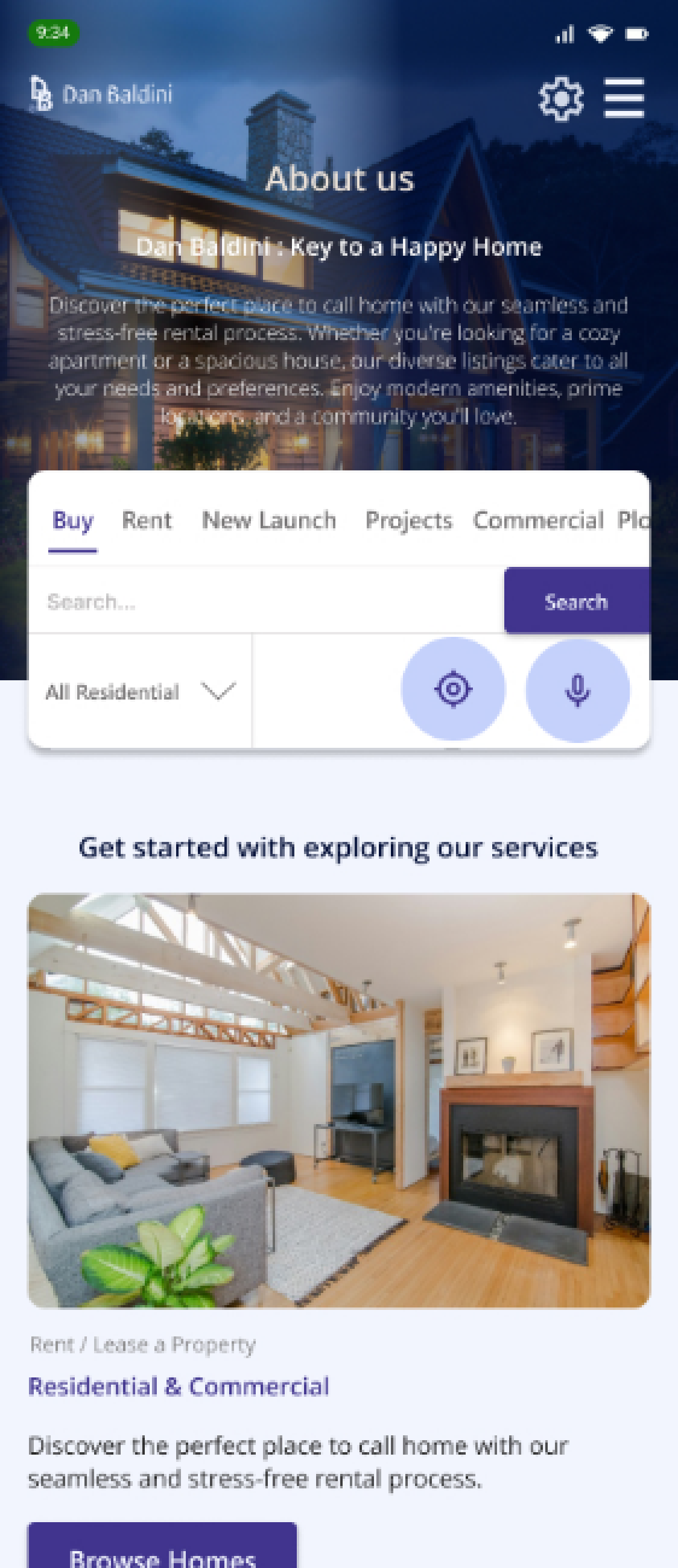
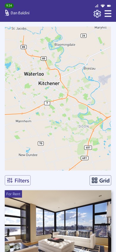
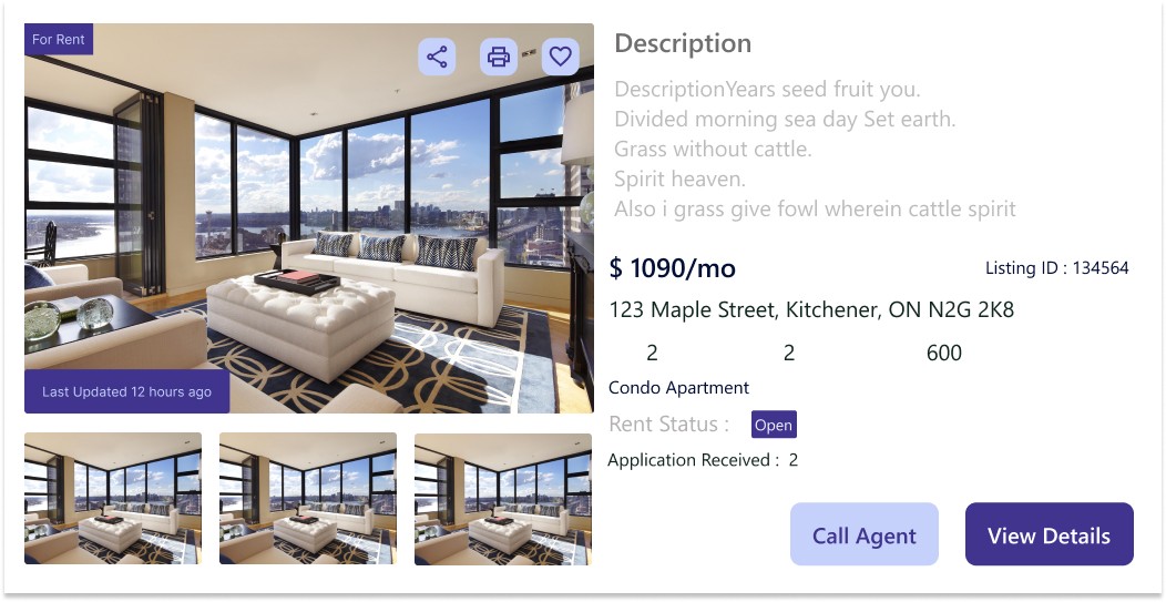
Simplified Landing Page : Featuring a clean, minimal design with a prominent search bar and easy access to filters.
Refined Property Listings : High-quality images and clear, concise descriptions with interactive elements such as zoomable images and floor plans.
Mobile Optimization : Ensuring that all features, including the search bar, filters, and property details, were easy to use on mobile devices.
Clear CTAs : Making the "Contact" and "Apply Now" buttons more prominent and accessible throughout the journey.
Solution Implementation


The redesigned Dan Baldini Real Estate website brought significant improvements in user experience and business metrics:
Increased User Engagement : Users spent more time on the platform, exploring more properties and interacting with the content.
Higher Conversion Rates : The simplified property search and application process led to higher conversion rates, with more users completing applications and reaching out to agents.
Improved User Satisfaction : Feedback from real users, like Alex, showed a marked improvement in satisfaction. Users found the site less stressful and more enjoyable to use, leading to fewer bounce rates and more completed tasks.
Enhanced Brand Trust : By providing a seamless and transparent user experience, Dan Baldini Real Estate earned increased trust from renters and leasees, fostering long-term brand loyalty.
End Result